Redesigning how hotels manage guest experiences at scale
INTELITY · GEMS 2.0 · HOSPITALITY SAAS · 2025
Lead product designer, sole designer on the platform. Research through developer handoff, with Intelity's product and engineering teams. Via Tangerine.
Problem
Staff worked around GEMS instead of with it. WhatsApp instead of the messaging module, paper lists instead of automation. A trust problem, not a feature gap.
What I did
Audited all eight modules, ran a cross-team problem mapping session, built the design system first, then rebuilt module by module in order of operational impact.
Result
Daily active usage up 34%, around 46 FTE hours recovered every week, eight modules shipping from one system.
The call
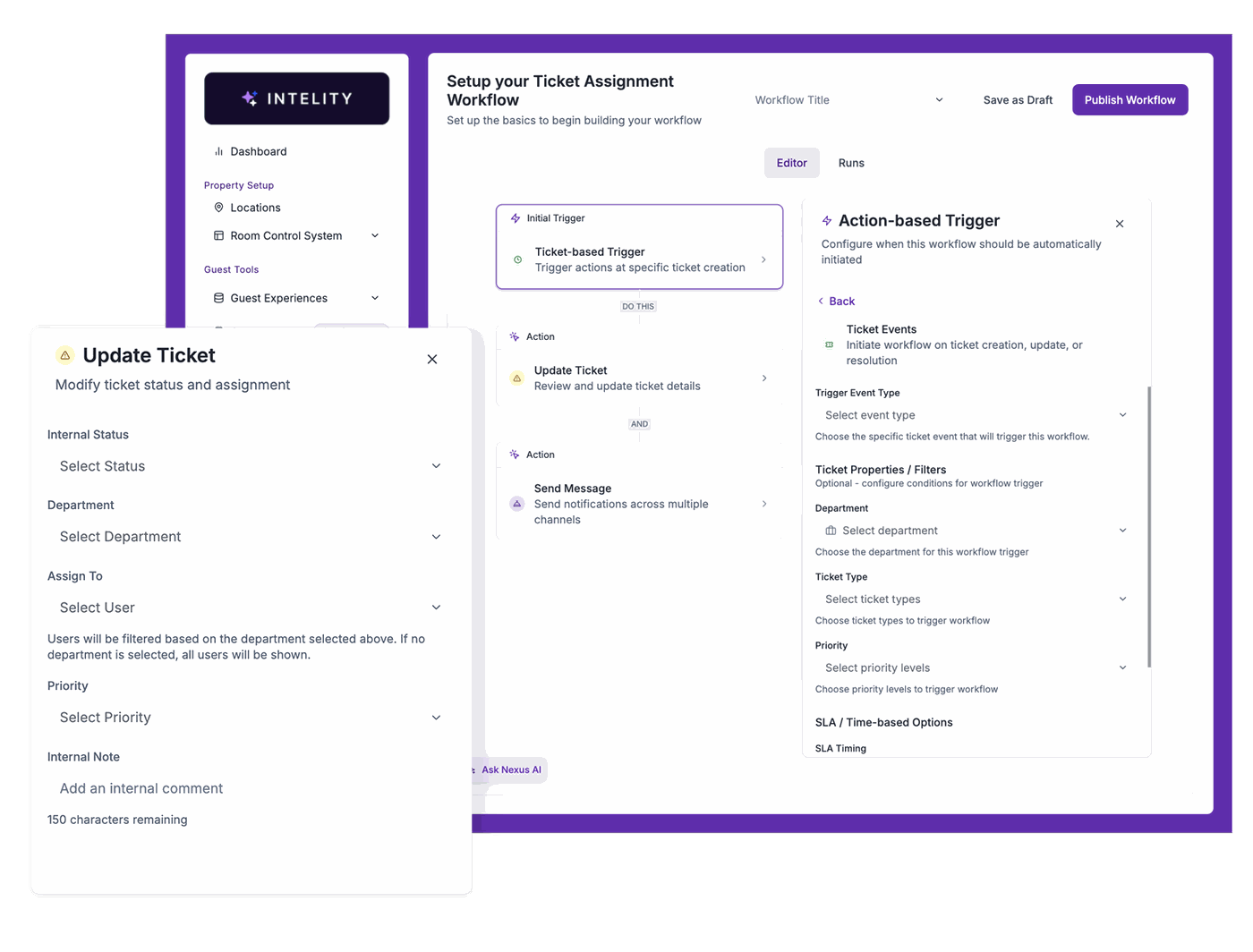
Nexus AI could have been a flashy visual flow editor. I built a structured rules table instead. Demos reward novelty, daily use rewards familiarity.
CONTEXT
A platform that had to think at hotel scale.
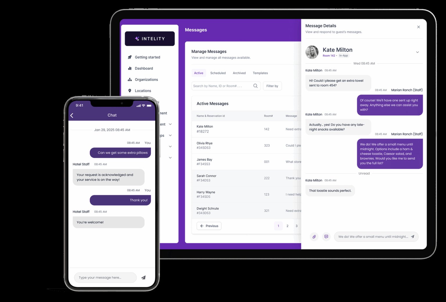
GEMS 2.0 is Intelity's operations platform, used daily by hotels around the world. Housekeeping, front desk, food and beverage and concierge all live in it: reservations, messaging, workflows, content and guest requests.
The product had accumulated complexity for years. Every new module had arrived with its own vocabulary and its own patterns. I joined through Tangerine as lead product designer, responsible for the core modules from research and wireframes through to high fidelity and handoff.
PROBLEM
Staff were working around the software, not with it.
Hotel operations do not stop. Staff need to act fast, often with a guest standing in front of them. The existing interface mixed too many concepts per screen, had no visual hierarchy, and no consistent component logic.
The result was workarounds. WhatsApp instead of the messaging module. Paper lists instead of the automation. That is not a missing feature. It is a trust problem, and you do not fix trust by shipping more surface.
So the brief I wrote for myself was not "add features". It was "make what already exists feel reliable enough that people actually use it".
INITIAL FINDINGS
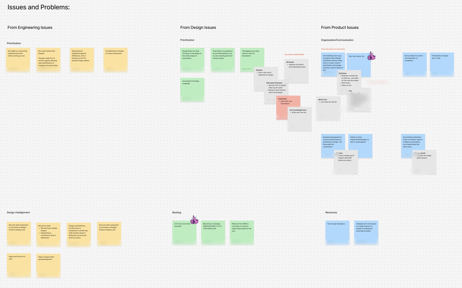
I audited all eight modules before touching a single screen.
Mixed tasks per screenScreens combined monitoring, configuration and action, so staff had to read everything to do anything.
Inconsistent componentsThe same concept looked and behaved differently across modules, so learning one taught you nothing about the next.
No language for stateRequest states had no shared visual system, and staff compensated with phone calls and paper.
Database-shaped tablesLists mirrored the database instead of operational urgency, hiding whatever needed action right now.
DESIGN PROCESS
System first, then module by module.
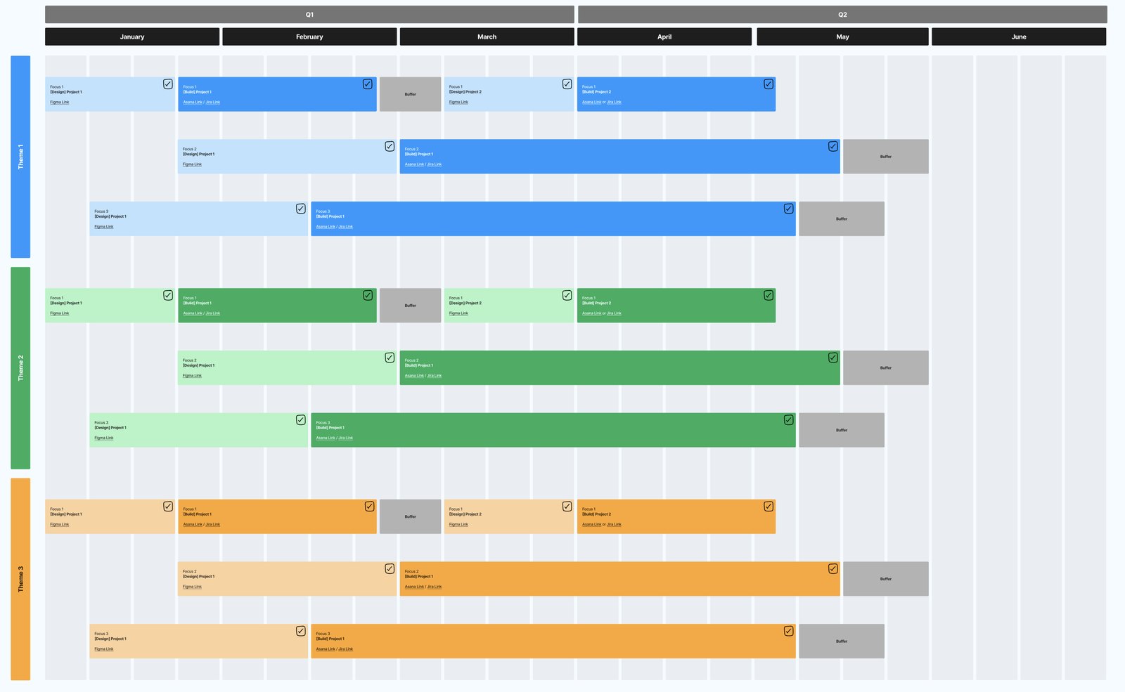
I started with the design system: tokens, input states, table patterns, status chips and modal flows. Defining the shared language first made every module after it faster and more consistent, and it is the reason eight modules could ship without drifting apart.
Then I moved through the modules in order of operational impact, from messaging and workflows to reservations, content, departments and integrations. Each one followed the same loop: wireframes against the audit findings, review with Intelity's product team, iteration, and a handoff doc with states and edge cases spelled out.
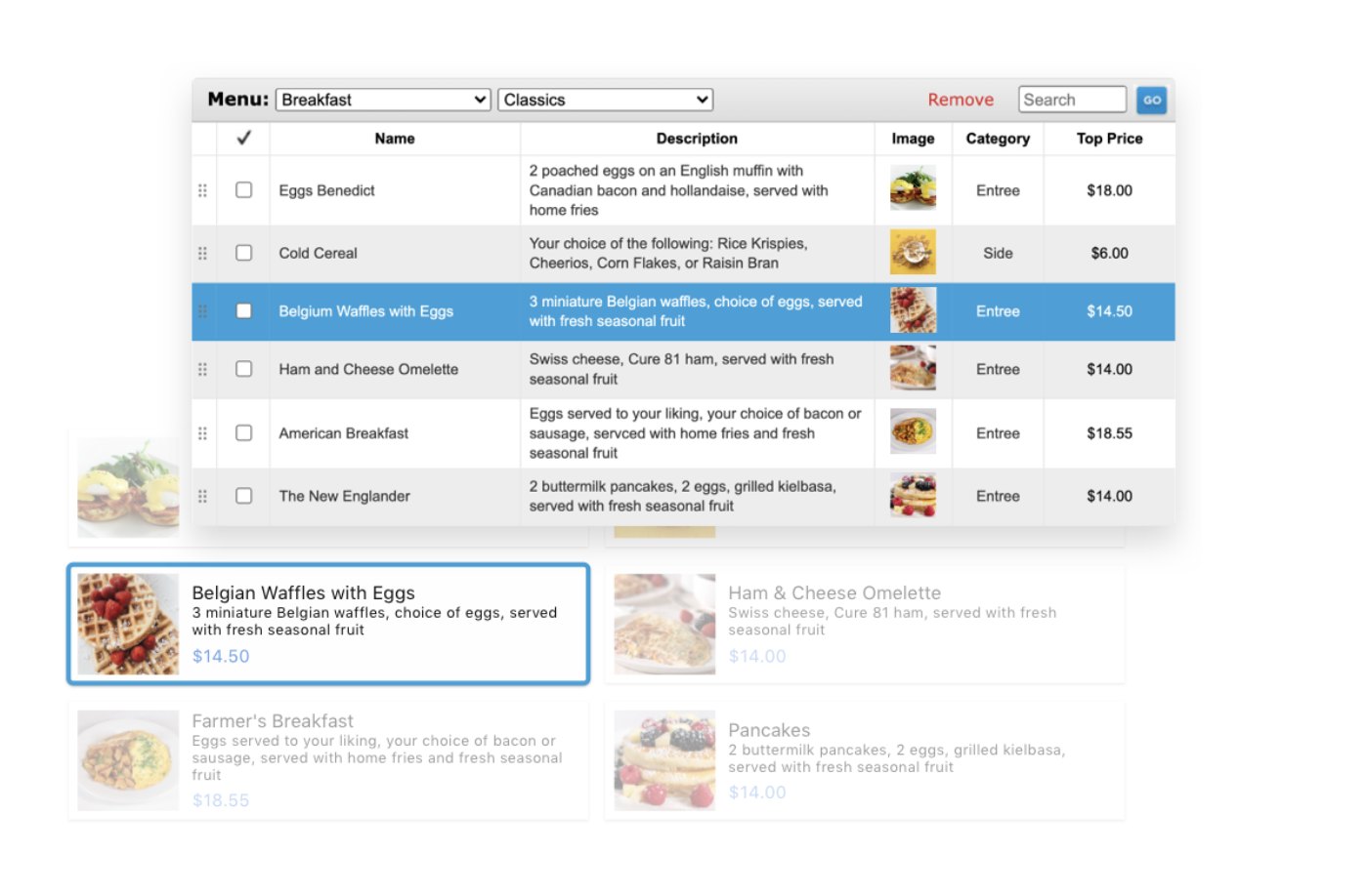
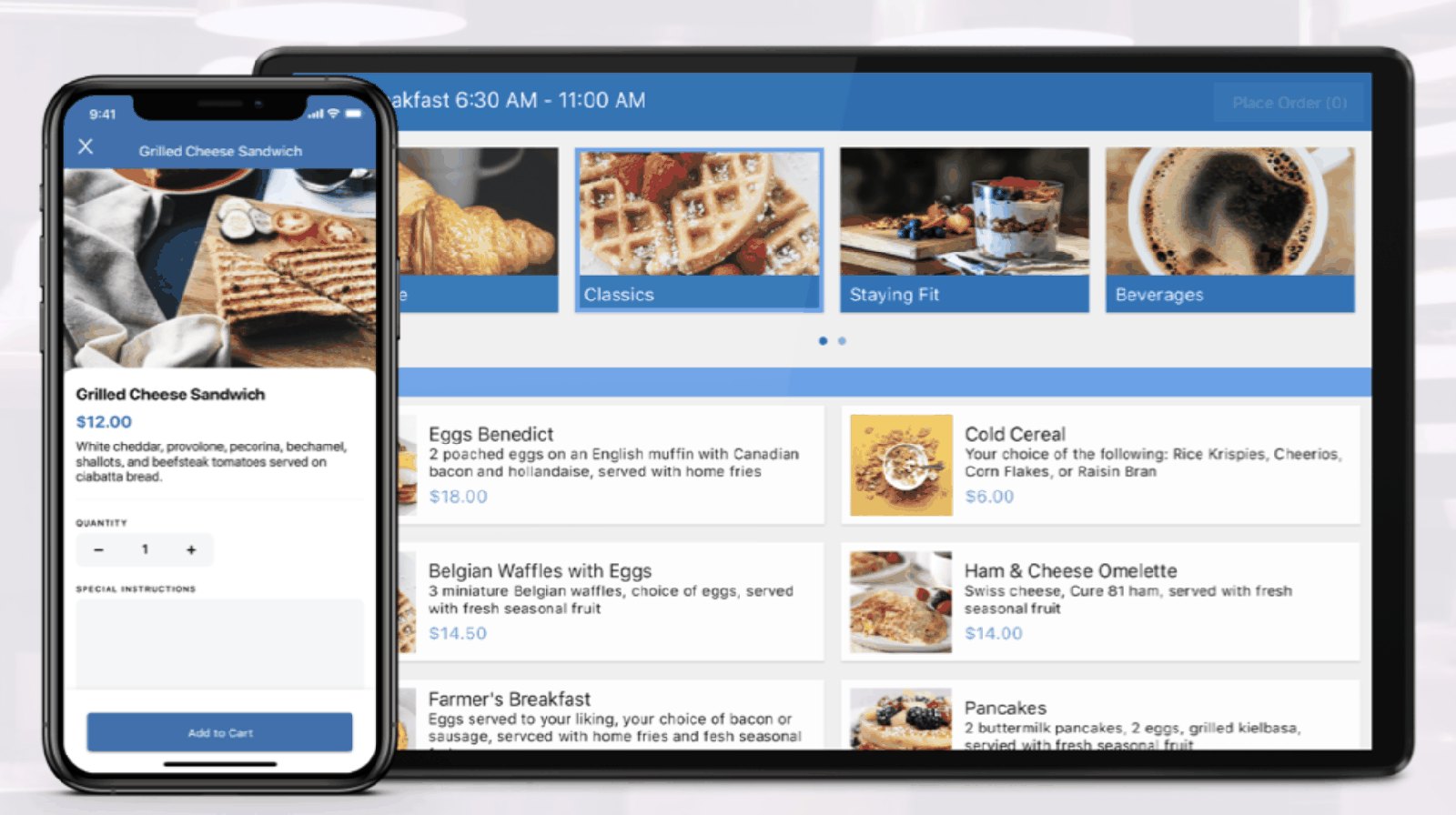
SMART DINING SHOWS THE APPROACH BEST: THE SAME DATA, RESTRUCTURED AROUND WHAT STAFF NEED FIRST
The staff platform is half of it. Guests see the other half.
GEMS runs the back of house, but the same content feeds what a guest touches in the room: the in room dining menu, housekeeping requests, the concierge. If the menu is a mess for staff, it is a mess for the guest thirty seconds later.
So I designed the guest surfaces against the same system. Same components, same state language, same ordering logic, sized for a tablet in the room and a phone in a pocket.
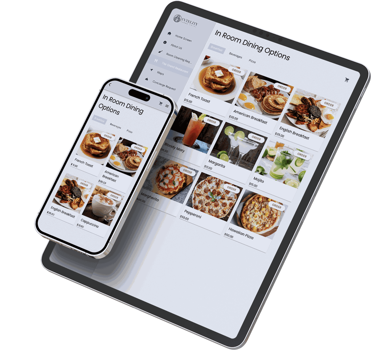
THE SAME MENU DATA, RENDERED FOR THE ROOM TABLET, THE GUEST PHONE AND THE STAFF QUEUE