Rethinking parking as experience, not transaction
WISEPARK · MOBILITY · CAPSTONE · 2024
Solo designer. Brand identity, mobile app UX, Webflow site and print. Capstone project at ORT University.
Problem
Drivers avoided parking apps, and everyone assumed it was price. Research said it was trust: they did not believe the spot would still be there on arrival.
What I did
Interviewed drivers, kept a diary of real parking attempts across Montevideo, then built the brand first and designed the app around the moments where doubt creeps in.
Result
One system across app, website and street level print, with confidence made visible before a driver commits to the drive.
The call
My first brand direction was a confident navy and teal. Research called it cold. I scrapped it entirely and rebuilt around a lighter palette, because the product's job was to feel like it was on your side.
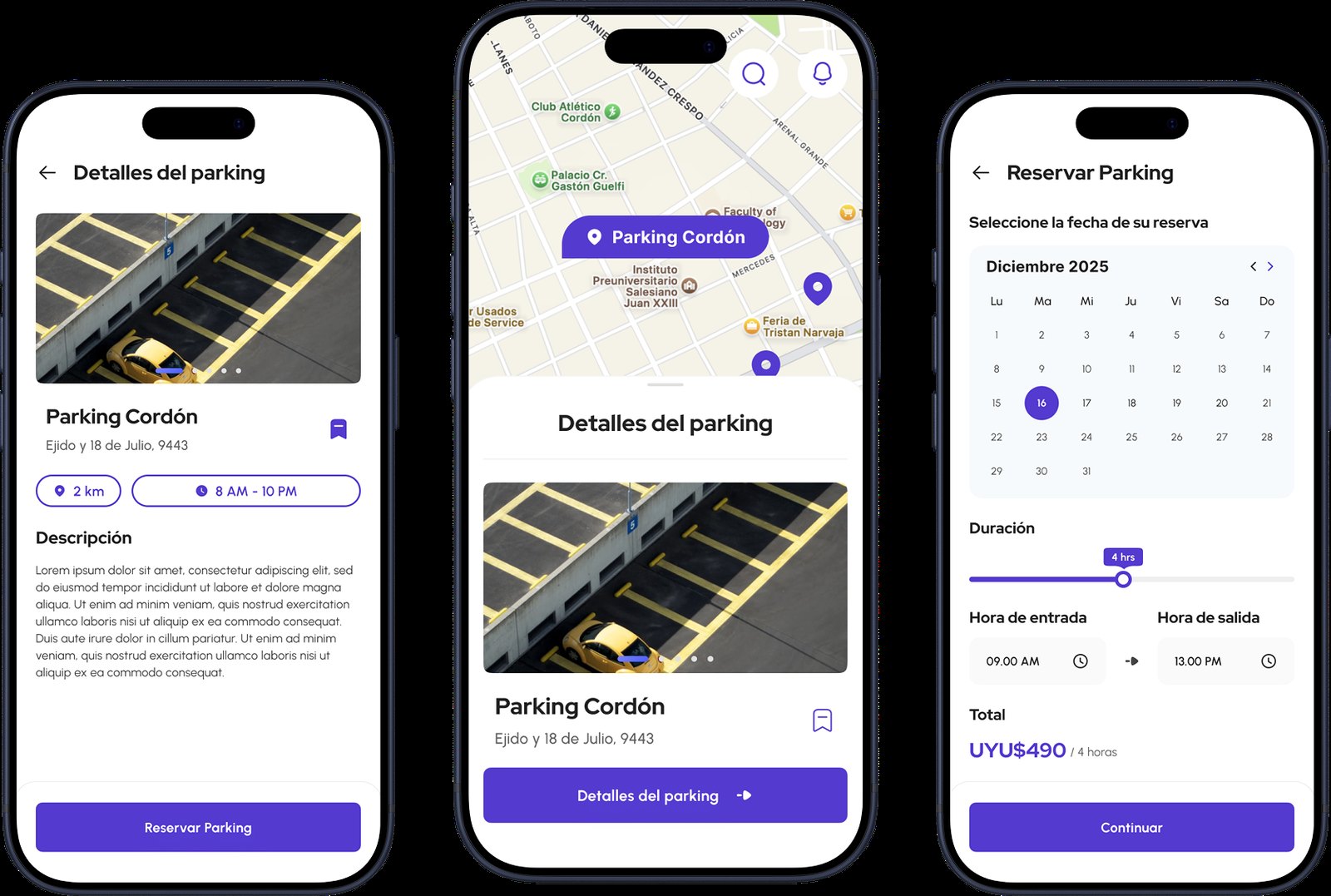
CONTEXT
No real users, no production pressure, treated rigorously anyway.
Wisepark was my capstone at ORT University: a complete redesign of a Montevideo parking marketplace. There were no real users, no client deadlines and no production constraints.
I treated it like a real project anyway, and it was the first time I owned the full spectrum from scratch. Brand identity, mobile app UX, Webflow website and physical communication materials. It is where I learned what end to end actually costs.
PROBLEM
The real barrier was not price. It was trust.
My initial assumption pointed at price and availability as the core friction. Research told a different story.
Drivers in Montevideo did not avoid parking apps because spots were expensive or scarce. They avoided them because they did not trust that the spot would actually be there when they arrived. The experience felt transactional and opaque.
Which reframed the design problem completely. It was not about listing more spots. It was about making confidence visible in the app, before the driver left home, not at the lot.
FINDINGS
What research changed about the brief.
Doubt has a locationThe anxiety does not happen at the barrier. It happens while you are still driving, wondering whether the drive is wasted. That is the moment the product has to answer.
Two sides, two fearsLucia commutes daily and has been burned by spots that were taken on arrival. Martin owns a driveway and fears no shows. The same trust gap, from opposite ends.
Fine print destroys trustPricing and cancellation buried in small type does more damage than a higher price shown upfront. Clarity is a trust feature.
Brand carries the promiseA driver meets the brand before the app, on a billboard or a sticker. If the brand feels like infrastructure, the app inherits that coldness.
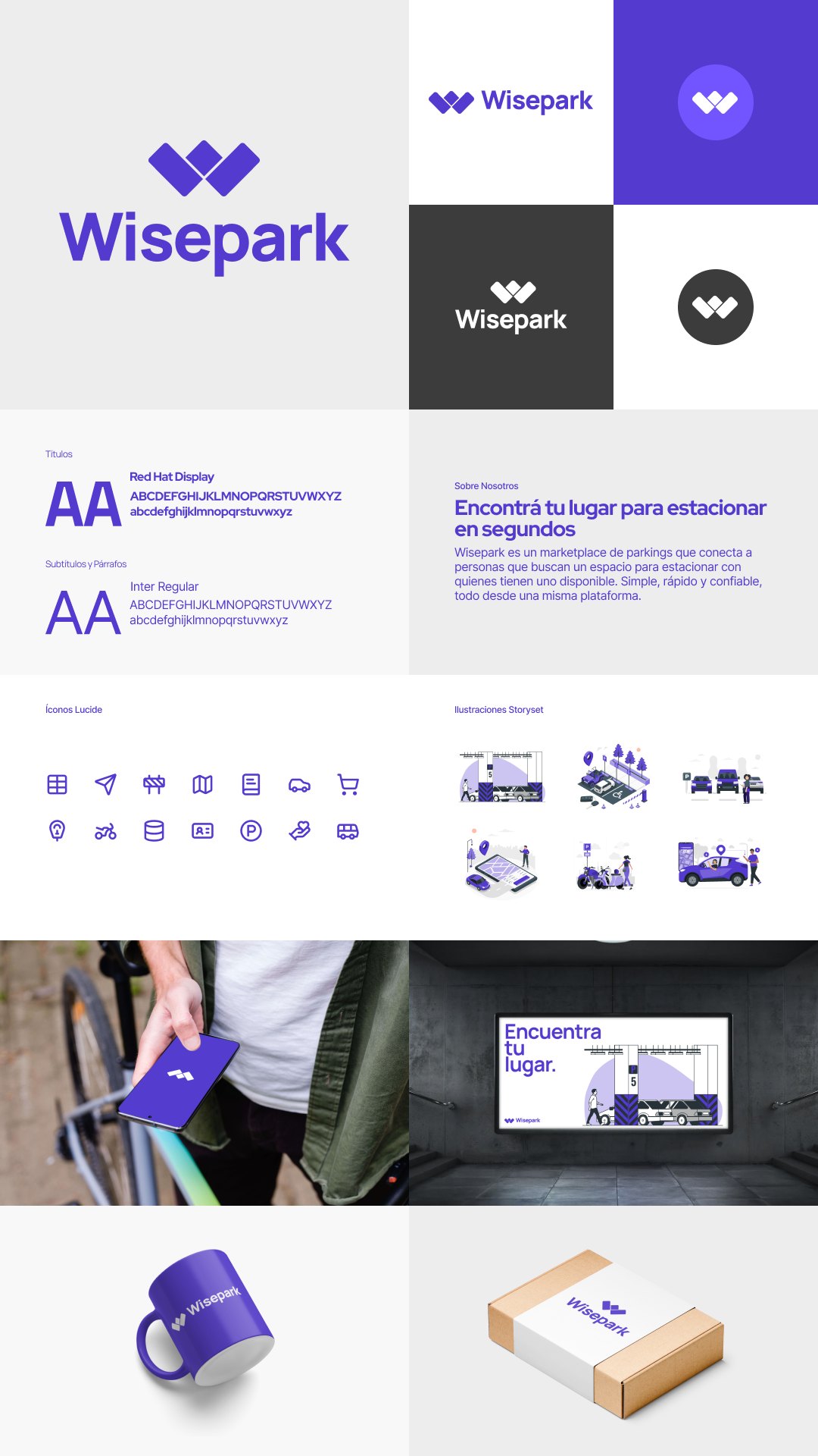
DESIGN PROCESS
Research first, then brand, then product.
I started with driver interviews and a diary study of real parking attempts across Montevideo, plus a competitive scan of the local apps. That is where the trust finding surfaced and reframed the whole brief.
From there I built the brand system, then designed the app flows around the three moments where doubt creeps in: search, booking confirmation and arrival. Each step had to answer a question the driver was already asking.
The Webflow site and the print materials came last, extending the same system to every touchpoint a driver might meet first.
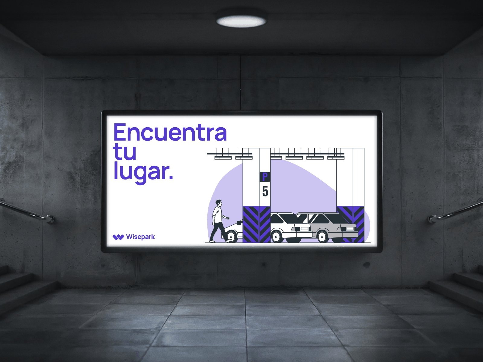
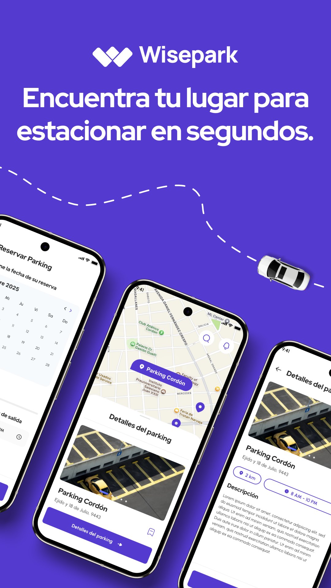
ONE BRAND SYSTEM, FROM APP SCREEN TO STREET BILLBOARD
OUTCOME
A complete system, delivered by one designer.
Wisepark shipped as a full identity and product system: brand, mobile app UX, a Webflow site and print materials, all built on the same language.
It has no usage metrics, because it never had users. What it has is the thing an academic project is actually for: the full discipline practised without shortcuts, and a research finding strong enough to make me throw away a brand direction I liked.
Academic freedom is rigour trainingNobody tells you to skip the research phase or compress the explorations. Wisepark let me practise the whole discipline end to end, which is exactly what client timelines do not allow.
Rigour is not resilienceWhat academia does not prepare you for is production negotiation: timelines, stakeholders, and the moment someone asks you to defend a decision with money attached. That came later, on real projects.
Kill the direction, not the insightScrapping the navy palette hurt, and it was correct. The research finding was the asset. The first execution of it was not.
NEXT CASE
Designing and building my own agency's site TANGERINE · 2025 →