Building the discovery layer for pickleball
OPEN PLAY FINDER · CONSUMER MOBILE · 2025 · LIVE
Lead product designer, embedded with the founding team. Discovery through launch, mobile first, designed in Subframe. Via Tangerine.
Problem
Finding a court, joining an open play session or discovering a coach was a patchwork of Facebook groups and word of mouth. The real gap was not booking.
What I did
Surveyed casual players, analysed how they coordinate today, interviewed Creators, then designed six core flows mobile first plus the marketing site and the design system direction.
Result
Live in Las Vegas. Six core flows shipped end to end, and the designs were used directly in the seed round.
The call
Responsive web would have shipped faster, but finding a court happens on the way there. We committed to mobile first and built the web as a secondary layer. The decision held.
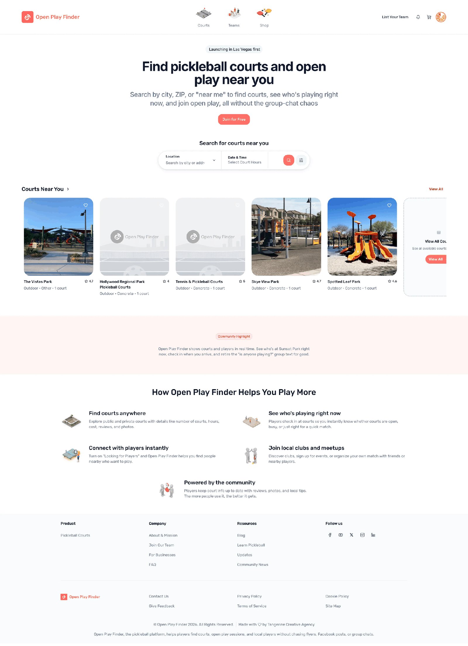
CONTEXT
The sport is growing. The infrastructure is not.
Pickleball is the fastest growing sport in the United States, but the software around it never caught up. Finding a court, joining an open play session, or discovering a local coach still runs on Facebook groups and word of mouth.
Open Play Finder set out to fix that. I joined as lead product designer via Tangerine and designed the product and the website from scratch: onboarding, court discovery, session RSVP, Creator Pro tools, messaging and tournaments.
PROBLEM
Two very different users. One product.
The product had to serve two audiences at once. Players looking for courts and sessions, and Creators, meaning coaches, organisers and club operators, who needed tools to build a presence and manage attendance.
Every screen had to work for a player arriving for the first time and for a Creator Pro managing their schedule. That tension drove almost every layout decision.
And underneath it sat a harder question. I went in assuming the product was a booking app. Discovery said otherwise.
FINDINGS
Nobody's core problem was booking.
The real gap was presencePlayers did not need a reservation. They needed to know whether anyone would actually be at the court when they arrived. Real time activity, not availability, was the thing worth designing around.
The group chat was the competitorCoordination already worked, badly, inside Facebook groups and text threads. Anything the app asked for had to be less effort than the chat it replaced.
Skill is the filter that mattersA game at the wrong level ruins the session. Capturing skill during onboarding is what makes every recommendation after it useful.
Creators carry the supplySessions exist because someone organises them. Creator tools were not a secondary feature, they were the supply side of the marketplace.
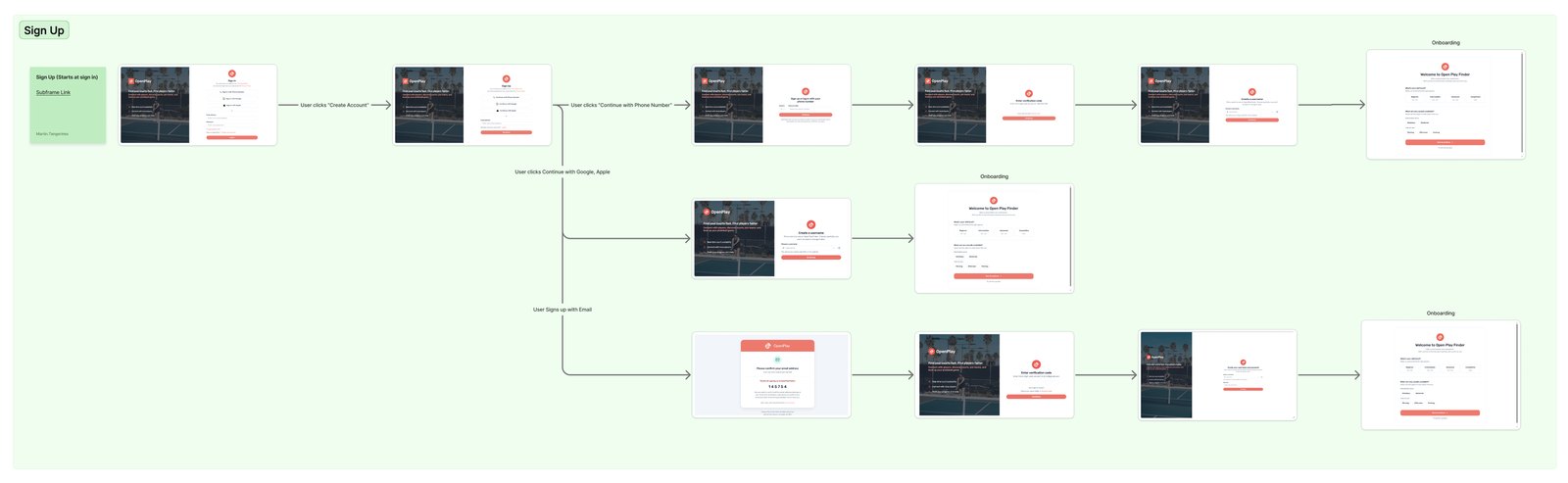
DESIGN PROCESS
From flows on paper to a live product, designed in Subframe.
I mapped the full player journey first: onboarding with progressive skill and preference capture, discovery, RSVP with waitlists and rosters, then check in on the day. Creator flows came second, layered onto the same surfaces rather than living in a separate app.
What made this project different is that I designed it in Subframe, where every screen is built from real components from day one. Instead of static mocks, the founding team reviewed working interfaces every week. I directed the system, hierarchy, states and interaction logic, while the tool accelerated production.
Each flow went through wireframes, review with the founding team, and iteration against real court and session data from Las Vegas.
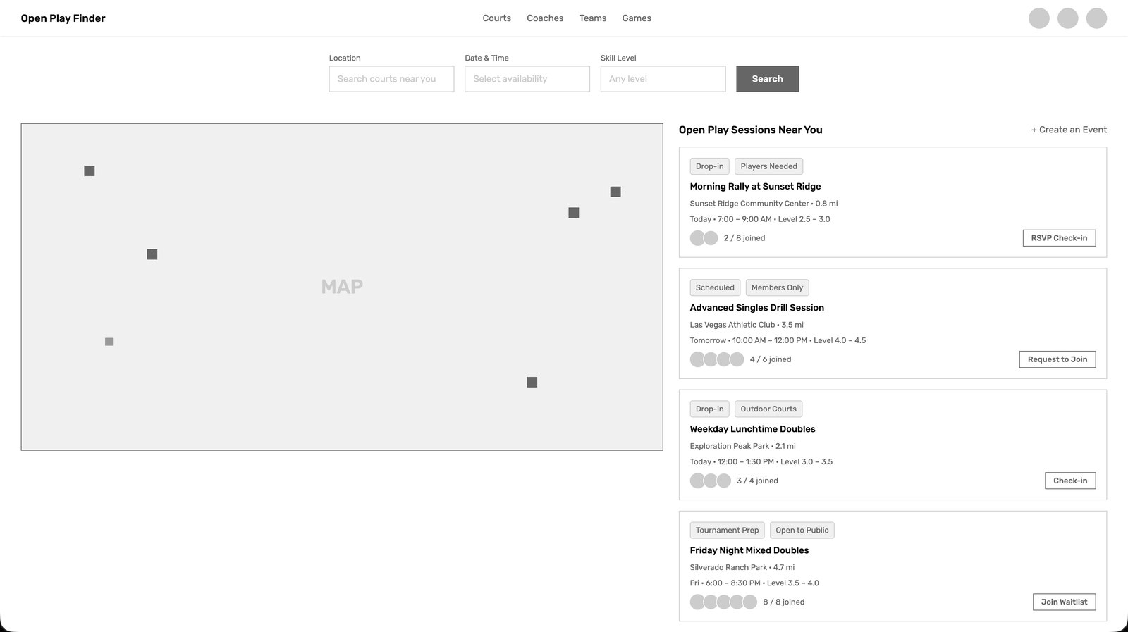
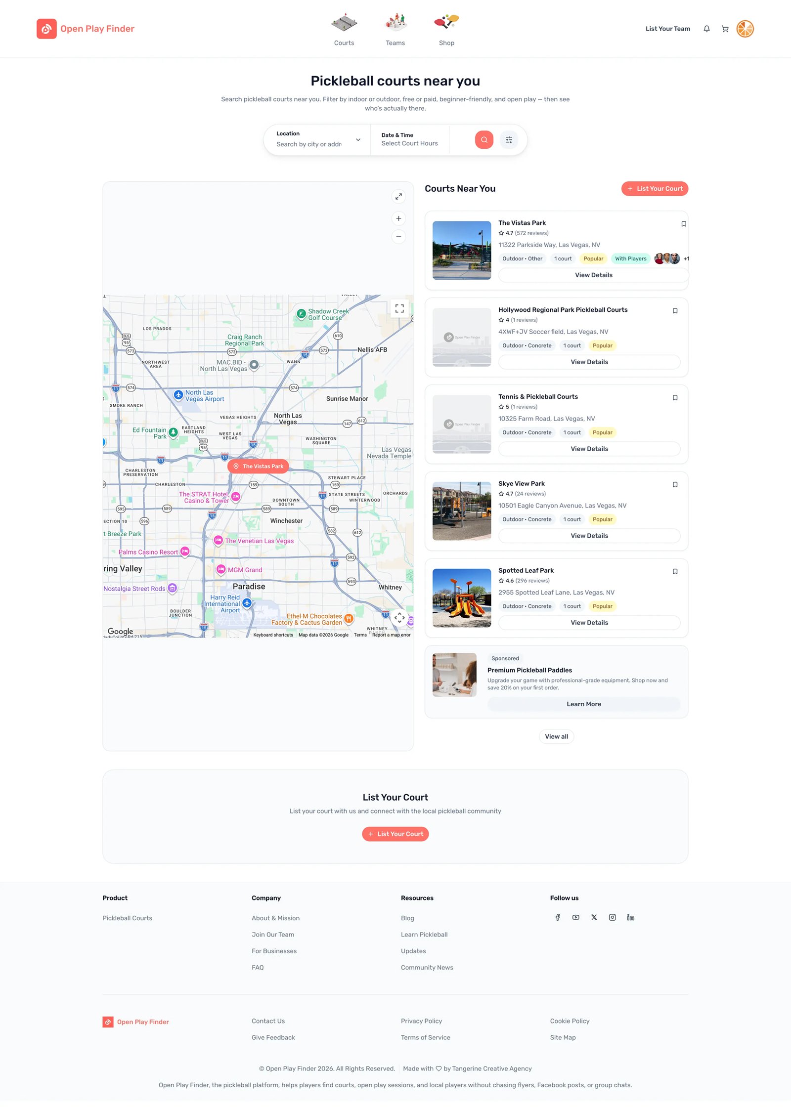
COURT DISCOVERY, FROM WIREFRAME TO SHIPPED
OUTCOME
Live, and used to raise.
Open Play Finder is live in Las Vegas today. Users sign up, onboard, discover courts, RSVP for sessions and connect with Creators. Six core flows shipped end to end.
The designs were also used directly in the company's seed round. That is not a usage metric, but for a zero to one product it is the outcome that mattered at that moment.
Design the riskiest surface firstCreator Pro got proportionally more design time than player onboarding because it was more visible in investor demos. In hindsight the player's first session was the riskier surface. It decides whether anyone comes back.
Test with real players earlierI would ask for testing with real players in week two, before starting Creator Pro. Demos tell you what impresses. Tests tell you what retains.
The tool accelerates, the designer decidesSubframe made production dramatically faster, but every decision that mattered, hierarchy, edge cases, what a new player sees first, was still a design decision. The tool amplified judgement, it did not replace it.
NEXT CASE
Rethinking parking as experience, not transaction WISEPARK · 2024 →